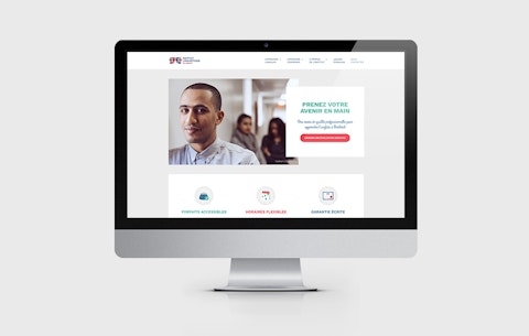
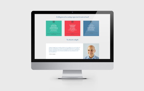
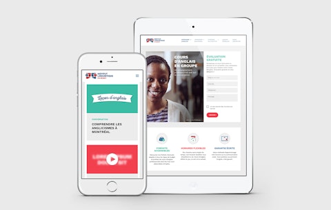
A long-standing partner of Prospek, Institut Linguistique was seeking to completely overhaul its website to better align it to the values of this respected Montreal language school. It was with this in mind that at the end of 2017 we recommended that our client take a brand new artistic direction and introduce a user experience that reflected the overall approach and policies of the institution. We also added a section offering English courses accessible to everyone.

People make the difference
The best way to learn English is not by downloading an app or enrolling in an online course but rather by having access to real teachers—qualified educators who adapt their teaching to their students and whose priority is their students’ success. How can a language school best use the digital world to demonstrate the importance of this value? By showcasing its actual teachers, students and facilities on its website. This way, students who make a virtual visit to the school and then set foot in the Institut for the first time know exactly what to expect: what you see is what you get!
An effective teaching method
When learning a new language, everyone wants to feel they’re making steady progress. Institut Linguistique understands this and pulls out all the stops to accelerate the learning curve: course levels adapted to the students, flexible schedules, well-constructed homework assignments, and more. It was essential that the website convey all of this, so we created a new section of short, clear and concise English lessons—a true reflection of the Institut itself!
“From choosing photos to designing icons, everything was customized to bring a breath of fresh air to the site and convey the strengths of the Institut in a positive, genuine manner.”
Charlotte Leblanc, directrice artistique
An agreeable experience
School does not have to be painful–on the contrary! Enjoying the experience and connecting with others helps English language students persevere and succeed. To better reflect this on the new Institut Linguistique website, we opted for bright colours, clean lines and a more casual style of writing.
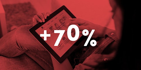
It’s still too early to objectively assess the impact of the new website, but the indicators1 to date have been very positive:
- 40% increase in the conversion rate
- 55% increase in the number of pages viewed per user
- 131% increase in the average session length
- 44% decrease in the bounce rate


