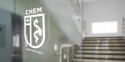
A leading professional development player in France's healthcare sector, CHEM hired Prospek to create its new logo. The logo, which had been targeted in the communication plan prepared for CHEM by Prospek, required a redesign to better reflect the company's international growth plan and recent multidisciplinary approach.

The new CHEM logo is based on three guiding principles: the credibility of the organization, its history, and its ground-breaking teaching practices. The logo now projects a more universal appearance: its typography calls to mind the top scientific journals, while the caduceus defines the organization’s business sector for healthcare professionals who may not yet be familiar with the brand. The shield, a strong "institutional" symbol, imparts the company's values of rigour and neutrality while reinforcing its deep roots. The cross represents the medical sector and serves as a plus sign to evoke the expansion of knowledge.


« One might think that teaming up with a client based overseas would be a logistical challenge, but this was not the case. The Prospek team was able to arrange for a number of working sessions at the CHEM head office in Brittany, which greatly facilitated our collaboration. We also took advantage of this opportunity to immerse ourselves in the company's culture and business environment, which enabled us to recommend creative options that corresponded with our client right from the start. »
Emmanuel Bégin, partner and creative director


