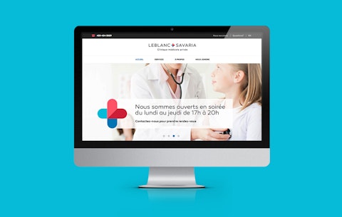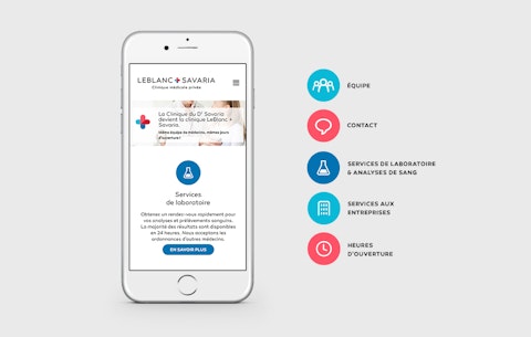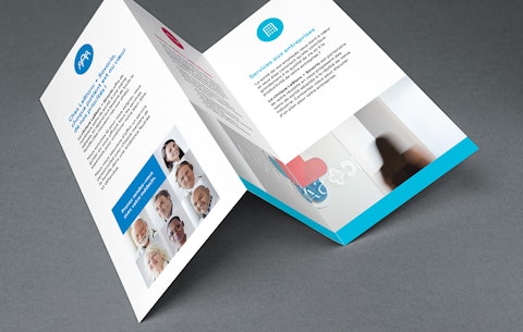
Following a change in management, Savaria Clinic decided to update its brand and communication tools to promote its new services and set itself apart from the competition. It called on Prospek to create a brand new logo, and our team enthusiastically took on the branding mandate.
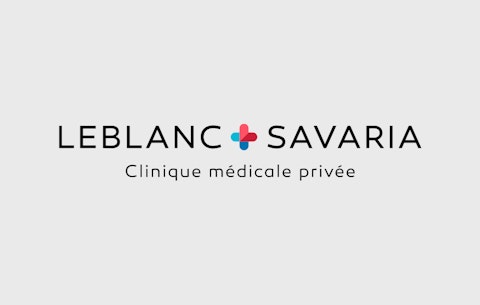
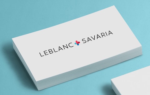
Our challenge: update the clinic's visual identity and guide it in its communications with its various target audiences. Advised by Prospek, the client adopted the name "LeBlanc + Savaria Clinic", with the new logo inspired by the company's strengths: accessibility, efficiency, service quality and friendly, approachable personnel.
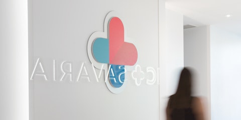
We felt it essential to focus on a clean design that was in keeping with the health sector, while emphasizing the "+" symbol, which calls to mind the medical cross. Within this symbol, in red tones, is the letter L (for LeBlanc), which also takes the shape of a heart to represent life, family and the human approach, all strong values of the Clinic. The logo's simplicity and gentle curves deliver the perfect balance between elegance and accessibility.
« By working hand in hand, we successfully developed a cohesive brand image and a communication strategy that achieved our client's objectives. »
Marie-Pier Doyon, account executive